Place Cards & Wedding Etiquette: Calligraphy Place Cards for UK Weddings
Place cards are one of those wedding details that often feel small on the surface, but in reality carry a surprising amount of weight. They are practical, yes — guiding guests to their seats and helping the day run smoothly — but they are also deeply personal. A place card is often the first moment a guest sees their own name within the setting of your wedding. It’s a quiet welcome, a subtle signal that they’ve been thought of, considered, and intentionally included.
From an etiquette perspective, place cards exist to bring calm and clarity to what could otherwise be a slightly chaotic moment. Traditionally, they sit at each place setting and display the guest’s name, while the seating plan shows the table assignment. This remains the most widely accepted and practical approach, particularly for UK weddings where venues often need clear guidance to serve the correct meal efficiently. Even at more relaxed celebrations, place cards play an important role in ensuring guests feel comfortable and confident as they enter the space.
That said, etiquette has softened over time. Today, place cards are less about rigid rules and more about hospitality. They’re a tool to help your guests feel looked after — especially in larger weddings, formal venues, or celebrations with multiple courses. Whether handwritten in calligraphy or printed with considered typography, the goal is always the same: ease, elegance, and intention.
As a wedding stationer working primarily with calligraphy, I’m drawn to the way place cards bridge function and beauty. They sit at the intersection of design and emotion. Unlike larger pieces of stationery, they’re intimate. Each one is individual, yet they work best as part of a cohesive whole. When done well, they elevate the table without overwhelming it.
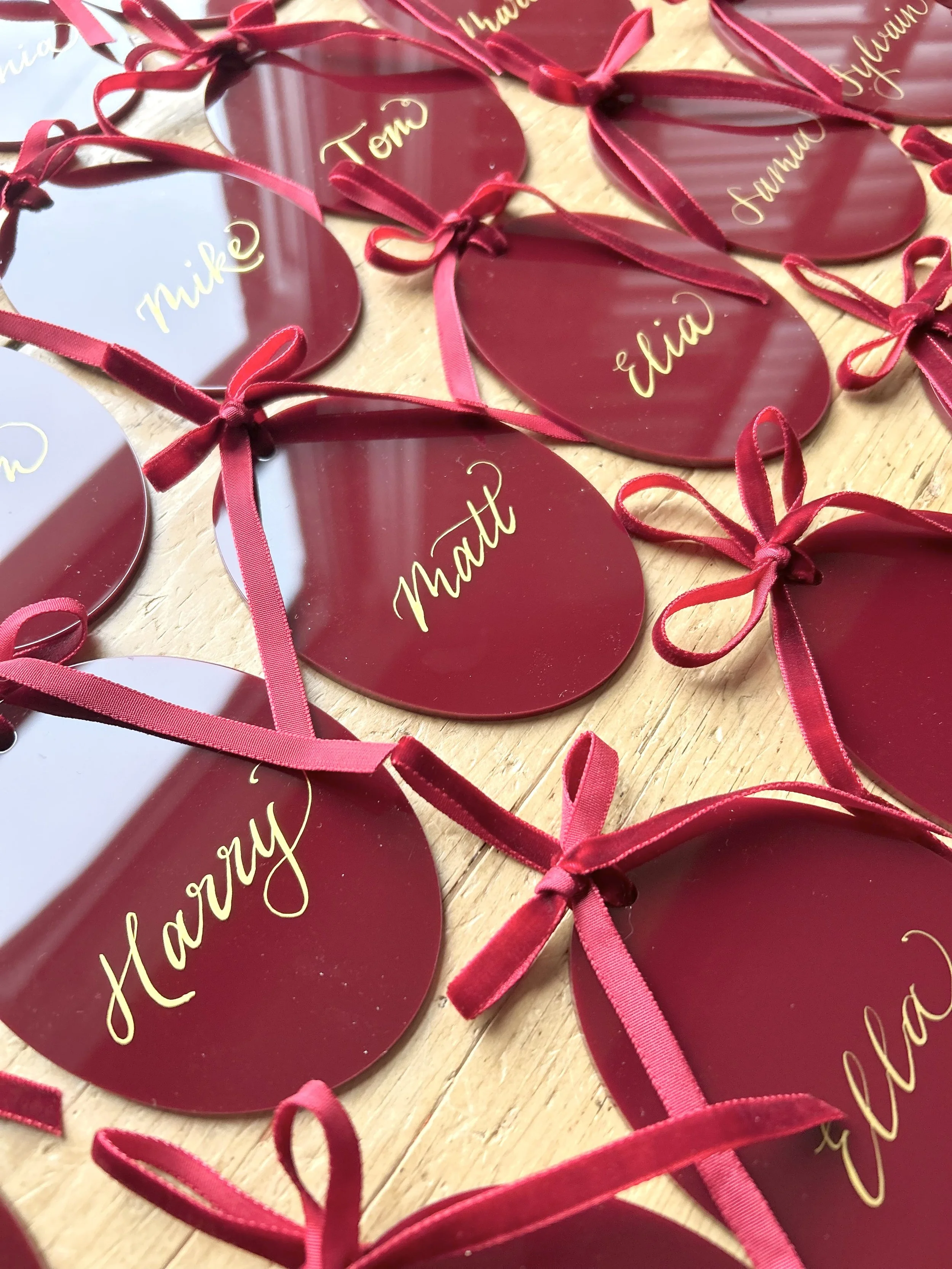
Calligraphy place cards remain a popular choice for UK weddings, and for good reason. There’s something inherently human about seeing a name written by hand. The slight variations, the softness of ink on paper, the sense of craft — it all contributes to a feeling of warmth that’s difficult to replicate digitally. For couples who value detail and texture, hand-lettered place cards often feel like the natural choice.
In terms of materials, the options are beautifully varied. Classic cardstock remains a timeless favourite, particularly when paired with textured papers such as cotton, handmade or lightly flecked stocks. These work wonderfully in traditional venues, stately homes, country houses and historic settings across the North West and beyond. They allow the calligraphy to take centre stage, especially when written in soft grey, warm sepia or deep black ink.
For couples leaning towards something more contemporary, place cards on acrylic, vellum or handmade paper with deckled edges have become increasingly popular. Clear or frosted acrylic offers a modern, architectural feel, particularly suited to industrial venues, modern barns or minimalist spaces. Vellum brings softness and a sense of layering, especially when paired with natural linens, stoneware or muted florals. These materials can still be hand-lettered, creating an interesting contrast between modern surfaces and traditional techniques.
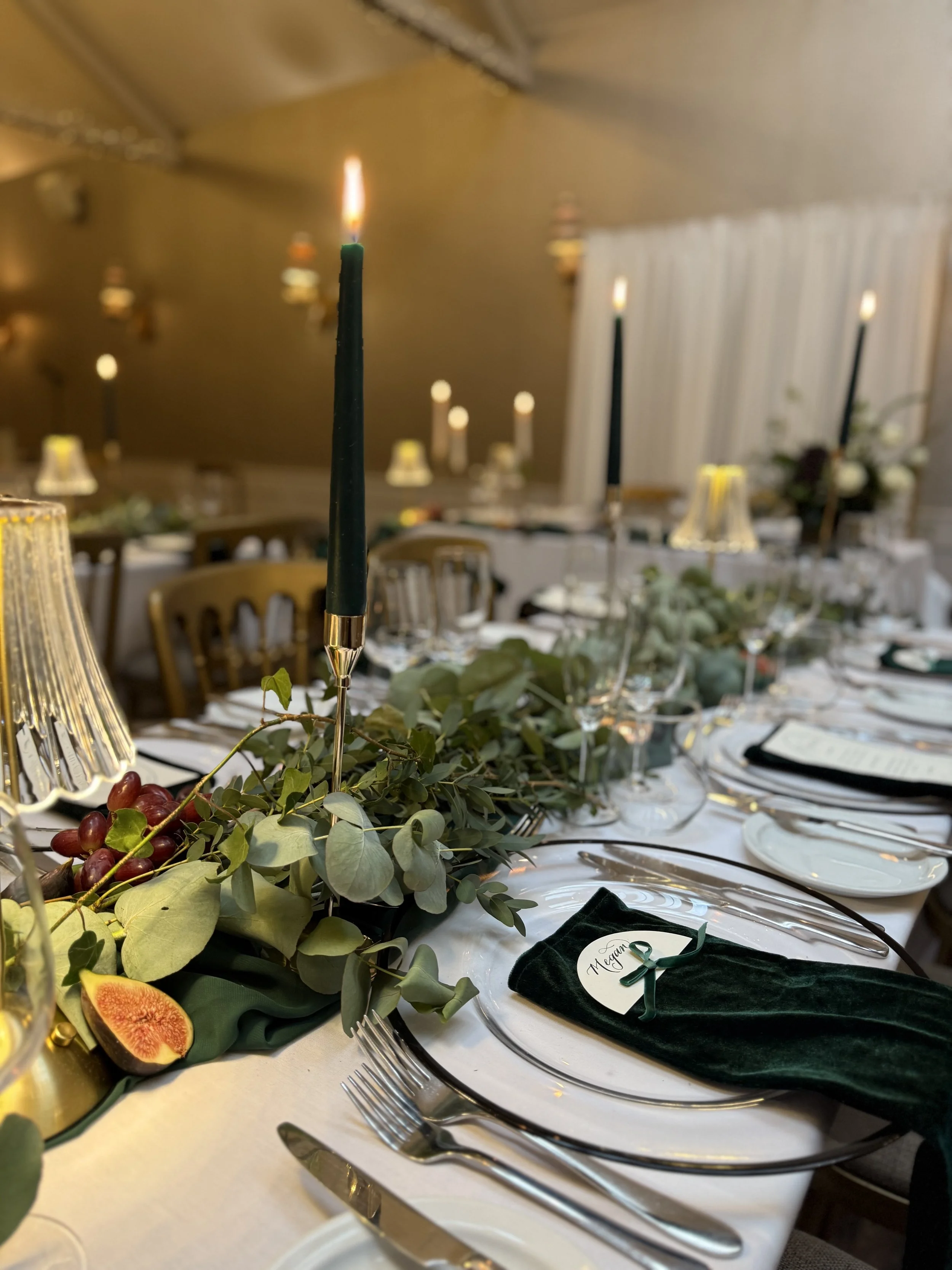
One of my favourite approaches is choosing place card finishes that respond directly to the venue. A light-filled orangery might call for airy papers and delicate ink tones, while a candlelit evening in a historic hall lends itself to richer colours, heavier stock and more dramatic calligraphy styles. Rather than following trends in isolation, I always encourage couples to consider how their stationery will feel within the space. Place cards don’t exist on a flat surface — they interact with linen, tableware, florals and light.
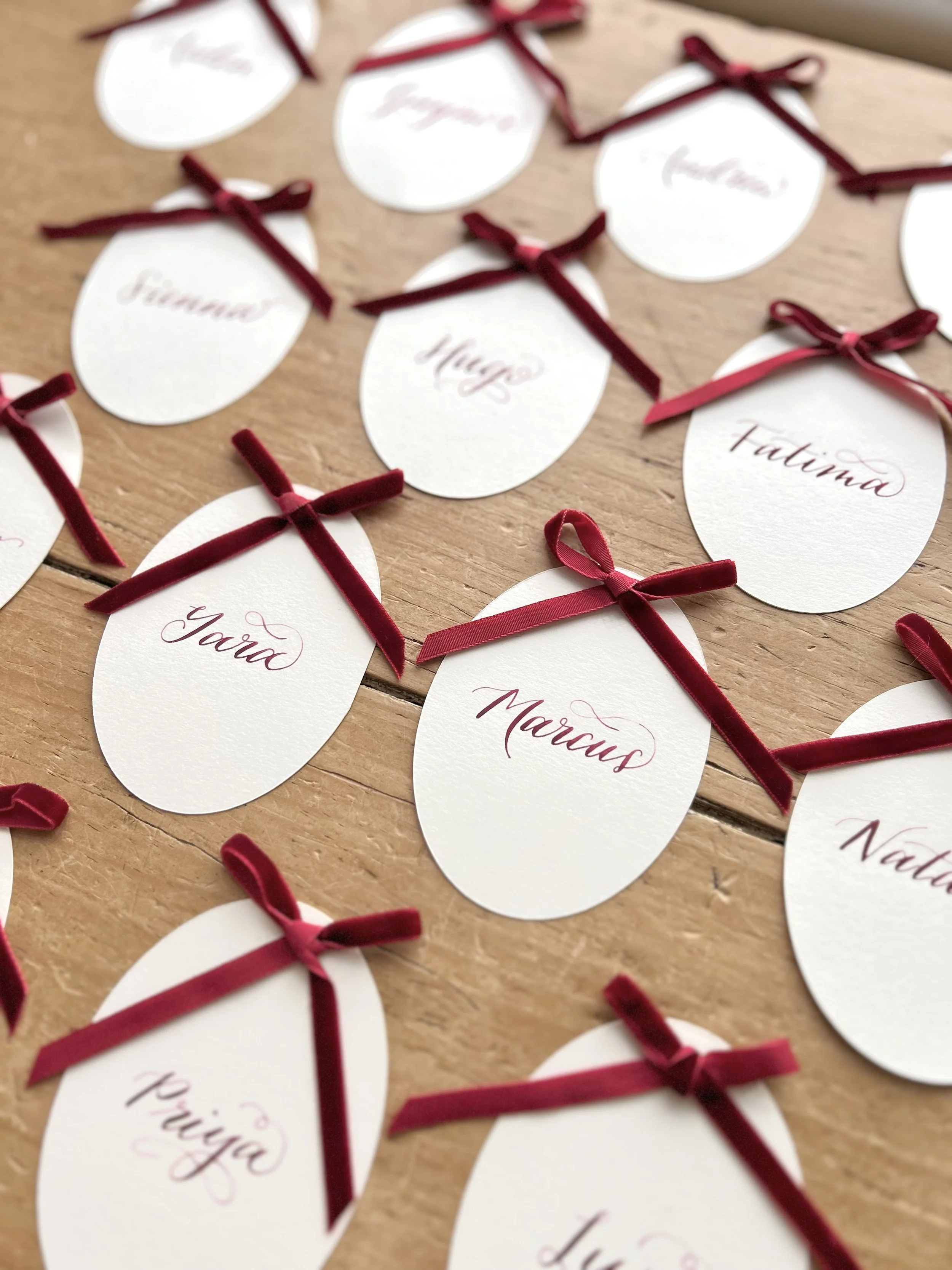
Trends do, of course, play a role, and they can be a helpful starting point. Organic shapes, torn edges, layered place cards and name cards doubling as favours are all popular choices at the moment. We’re also seeing a move towards less rigid layouts: place cards tucked into napkins, resting against menus, or paired with wax seals or pressed florals. These details feel relaxed and intentional, rather than overly formal.
That said, longevity matters. Weddings are full of fleeting moments, but the details you choose should still feel right when you look back. My own preference leans towards pieces that feel quietly confident rather than overly trend-driven. Thoughtful materials, balanced spacing and well-executed calligraphy will always outlast novelty.
There’s also the practical consideration of names — something that can cause surprising stress. From an etiquette standpoint, first names are perfectly acceptable for most modern weddings, particularly when paired with a seating plan. Titles and surnames tend to suit more formal occasions or traditional family expectations. The key is consistency. Whatever approach you choose, it should feel aligned with the tone of your day as a whole.
Meal choices are another layer to consider. While symbols or colour coding on place cards were once common, many UK venues now prefer discreet alternatives, such as escort cards or separate catering lists. If meal indicators are needed, they can be incorporated subtly on the reverse of the card or through minimal marks that don’t detract from the design. This is where experience and collaboration with your venue or planner becomes invaluable.
What I love most about place cards is their quiet impact. They’re not the first thing guests notice, and they’re rarely the most talked-about detail — but they contribute to the overall feeling of care that defines a beautifully planned wedding. When a guest finds their name waiting for them, written by hand, placed intentionally, it creates a small but meaningful pause in the day.
For me, designing and lettering place cards is as much about restraint as creativity. It’s about knowing when to let the materials speak, when to simplify, and when a subtle flourish is enough. Every wedding is different, and the best place cards are the ones that feel completely at home within their setting.
Whether you’re planning an intimate celebration or a larger gathering, place cards are an opportunity to slow things down, to think about your guests individually, and to bring a sense of warmth to the table. When chosen with care — in conversation with your venue, your stationery, and your overall vision — they become far more than just names on a card. They become part of the atmosphere, part of the welcome, and part of the story you’re telling on the day.
If you’re planning your tables and beginning to think about place cards, I’d love to help you explore what might feel right for your wedding. From hand-written calligraphy to considered materials and finishes, place cards are one of those details that quietly bring everything together. You can view my on-the-day wedding stationery, or get in touch to talk through your venue, your tables and the atmosphere you’re hoping to create.